A data pipeline architecture diagram is your visual blueprint, showing exactly how data travels from all its different sources to a final destination. Think of it less like a technical drawing and more like a detailed city map for your data. It shows every road (how data gets in), intersection (where it gets transformed), and major building (your storage and analytics tools).
At the end of the day, it’s the single source of truth for your entire data flow.
The Blueprint for Your Data’s Journey

A good diagram does so much more than just connect boxes with arrows. It tells the story of how raw, messy information is turned into a genuinely valuable business asset. When you can see the entire process laid out, your teams can finally understand it, troubleshoot it, and make it better.
This visual map is also a powerful communication tool. It creates a shared language that bridges the gap between different teams who often see the data world from completely different perspectives.
- Data Engineers can spot the technical infrastructure, see dependencies clearly, and identify potential bottlenecks before they become major headaches.
- Data Analysts get a clear picture of where their data is coming from, what cleaning has been applied, and how much they can trust it.
- Business Leaders can finally grasp the overall data strategy and see how it supports company goals, all without getting bogged down in the technical weeds.
Without this blueprint, data projects are notorious for spiraling out of control due to miscommunication, scope creep, and expensive rework. A solid diagram ensures everyone is on the same page from the get-go, creating a foundation for a data ecosystem that’s both reliable and built to scale.
Why You Can’t Afford to Skip This
The sheer volume of data being generated today makes these diagrams absolutely essential. The global datasphere is projected to swell from 33 zettabytes in 2018 to a staggering 175 zettabytes by 2025. This explosion of information has forced data pipelines to evolve from simple, straight lines into complex, high-speed systems built for massive scale.
In fact, teams with properly architected systems often see 40-60% time savings in data preparation alone. You can discover more insights about this data evolution and its impact in recent studies.
A data pipeline architecture diagram isn’t just a technical artifact; it’s a strategic asset. It aligns teams, minimizes risk, and ensures that your data infrastructure can support your business goals now and in the future.
Ultimately, this visual guide serves a ton of purposes. It’s invaluable for planning new pipelines, debugging existing ones, and even onboarding new team members who need to get up to speed fast. It turns abstract processes into a concrete, understandable map that makes even the most complex data flows manageable for everyone involved.
Core Components of a Data Pipeline Diagram
Every data pipeline diagram, no matter how complex, boils down to a few core stages. Here’s a quick breakdown of what you’ll typically see and what happens at each step.
| Component | Function | Common Tools/Technologies |
|---|---|---|
| Data Sources | The origin points of your data, such as SaaS apps (Salesforce), databases, or event streams. | CRMs, ERPs, PostgreSQL, Kafka, APIs |
| Ingestion/Extraction | The process of moving raw data from its source into a centralized location, like a data lake or warehouse. | Fivetran, Airbyte, custom scripts |
| Storage | The central repository where raw or staged data is stored for processing. | Snowflake, BigQuery, Redshift, Amazon S3 |
| Transformation | Cleaning, modeling, and structuring the raw data to make it useful for analysis. | dbt, SQL, Spark |
| Orchestration | The “conductor” that schedules, manages, and monitors the pipeline’s workflows to ensure they run on time. | Airflow, Dagster, Prefect |
| Analytics/BI | The end-user tools where stakeholders consume the prepared data through dashboards and reports. | Tableau, Looker, Power BI |
| Reverse ETL | The process of syncing enriched data from the warehouse back into operational business tools. | Hightouch, Census |
Understanding these key pieces is the first step toward reading—and eventually building—your own effective data pipeline diagrams.
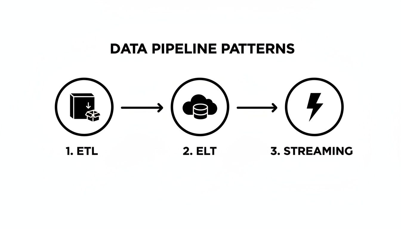
A Look at Common Data Pipeline Patterns
Data pipelines aren’t a one-size-fits-all deal. Think of it like a city’s transportation network: you’ve got massive highways for cargo trucks and nimble bike lanes for local trips. Each serves a different purpose, and the same is true for data pipeline architectures. Getting a handle on these common patterns is the first step to designing a data pipeline architecture diagram that actually works for your business.
Each pattern comes with its own philosophy about when and where data gets processed. Picking the right one means weighing the trade-offs between speed, flexibility, cost, and complexity.
Let’s break down the main patterns you’ll see out in the wild.
The Classic: ETL (Extract, Transform, Load)
The ETL (Extract, Transform, Load) pattern is the old-school workhorse of the data world. It’s like a traditional manufacturing assembly line. You pull in raw materials (data) from your sources, run them through a dedicated factory floor (a transformation engine) to be processed and refined, and only then do you load the finished product (clean data) into the warehouse.
In this model, all the heavy lifting—the transformation logic—happens before the data ever hits its final destination. This was crucial back when on-premise data warehouses had expensive and tightly linked compute and storage. You had to clean everything up first to avoid wasting those precious, pricey resources.
ETL is almost always tied to batch processing. Data gets collected and processed in big, scheduled chunks—think of a job that runs every night to update yesterday’s sales figures.
When does ETL still make sense?
- Legacy Systems: It’s still very common in organizations with established on-premise data warehouses.
- Heavy Transformations: If your data needs super complex, resource-intensive cleaning or aggregation, it can be better to offload that to a dedicated engine.
- Compliance Needs: For scenarios where sensitive data has to be masked or anonymized before it even lands in a central repository.
The Modern Standard: ELT (Extract, Load, Transform)
The rise of powerful cloud data warehouses like Snowflake and BigQuery completely flipped the script, giving us ELT (Extract, Load, Transform). This approach is more like having a fully-stocked, high-tech workshop right inside your warehouse.
Instead of transforming data first, you just pull it from the source and dump it directly into the cloud data warehouse, raw and unfiltered. All the transformation work—the cleaning, joining, and modeling—happens right inside the warehouse, using its nearly limitless, scalable compute power. This is where tools like dbt have become the gold standard for managing those in-warehouse transformations.
This isn’t just a minor shift; it’s a seismic one. The data pipeline tools market is rocketing ahead with a 26.8% CAGR, blowing past legacy ETL’s 17.1% growth. It’s a reflection of a massive architectural change, with 65% of organizations now leaning into cloud-native pipelines built on ELT. This approach gives you schema-on-read flexibility, which is critical now that 61% of SMB workloads live in the cloud. You can learn more about real-time data integration growth rates and see this trend in action.
ELT decouples storage from compute, which is a game-changer for flexibility. You can affordably store all your raw data and figure out how to model it later. This opens the door to a much wider range of analytics without having to re-ingest everything from scratch.
When You Need It Now: Real-Time Streaming Pipelines
But what happens when waiting for a nightly batch job is simply too slow? For things like fraud detection, real-time personalization, or IoT sensor monitoring, you need insights now. That’s where a streaming architecture comes in.
Instead of a reservoir, picture a constantly flowing river. A streaming pipeline processes data continuously, event by event, as it’s generated. Tools like Apache Kafka or Amazon Kinesis act as the central nervous system, capturing a non-stop flow of data and making it available for immediate processing.
This pattern is all about low latency and high throughput, letting your applications react to new information in milliseconds, not hours. But that speed comes at a price: complexity. The entire system has to be engineered for resilient, continuous operation, which demands a totally different set of tools and skills. Juggling the timing and sequence of all these moving parts is exactly where solid pipeline orchestration becomes non-negotiable. For a deeper look, check out our guide on the best data pipeline orchestration tools out there today.
Choosing the right pattern is the first huge decision you’ll make when designing your data pipeline architecture diagram. It’s the foundation that everything else—from the tools you pick to your operational costs—will be built on.
Building a Modern Cloud Data Pipeline
Alright, enough with the theory. The best way to really wrap your head around a modern data pipeline architecture diagram is to build one, step by step. We’re going to assemble a complete, cloud-native pipeline using a classic, real-world scenario: getting customer data from Salesforce into Snowflake for some serious analysis.
This isn’t just about moving data around. This is about unlocking the value trapped inside the tools your teams use every day. By pulling Salesforce data into a central warehouse, you can finally run deep sales performance analysis, build predictive models, and make genuinely data-driven decisions.
This diagram shows how things have evolved, moving from the old-school batch ETL process to modern ELT and real-time streaming.
You can see the big shift right there—the move toward loading raw data into the cloud first (ELT). This approach gives data teams way more flexibility than the rigid, pre-defined transformations of older ETL models.
Stage 1: Ingestion with Change Data Capture
Our pipeline’s journey starts with ingestion. The first job is to pull data from Salesforce and get it into our cloud data warehouse, Snowflake. Instead of writing custom, brittle API scripts that are a nightmare to maintain, the modern playbook uses a dedicated Change Data Capture (CDC) tool like Fivetran or Airbyte.
CDC is a game-changer. Rather than grabbing the entire Salesforce database every time it runs, it smartly detects only the changes—a new lead, an updated opportunity, a deleted contact—and syncs just that new info. This is way easier on Salesforce’s API and keeps our data fresh without those huge, slow bulk updates.
On a diagram, this is simply an arrow going from the Salesforce logo to the Snowflake logo, with the Fivetran icon sitting on top as the data mover.
Stage 2: Storage and In-Warehouse Transformation
Once the data lands, we hit the storage and transformation stage. Fivetran drops the raw, untouched Salesforce data straight into Snowflake. This is the “ELT” pattern in action. We’re using Snowflake’s powerful and scalable compute engine to do all the heavy lifting.
Now that our data is sitting in the warehouse, it’s time to clean it up and make it useful. This is where a tool like dbt (Data Build Tool) shines. With dbt, your team can write version-controlled, modular SQL to transform that raw data into pristine, analytics-ready tables.
For our Salesforce example, this is where you’d:
- Join Objects: Combine
Account,Opportunity, andUsertables to get a single, 360-degree view of sales activities. - Clean Data: Standardize state abbreviations, fix inconsistent currency formats, or cast data types correctly.
- Create Aggregates: Build summary tables, like monthly recurring revenue (MRR) by sales rep, so your BI dashboards load in a snap.
In a diagram, this looks like a circular arrow inside the Snowflake environment labeled “dbt transformations.” It’s a great visual cue that all the modeling work is happening right there in the warehouse.
Stage 3: Orchestration—Managing the Workflow
When you have a multi-step process like this, you need a conductor to make sure every part runs in the right order, at the right time. That’s the job of an orchestration tool. Think Apache Airflow or Dagster.
The orchestrator defines the entire workflow as a Directed Acyclic Graph (DAG). It’s essentially a set of instructions: “First, run the Fivetran sync. Only when that finishes successfully, kick off the dbt models.”
An orchestrator is the central brain of your data pipeline. It manages dependencies, handles retries on failure, and sends alerts when something goes wrong, turning a collection of scripts into a reliable, automated system.
This layer is what guarantees your data is always fresh and your transformations aren’t running on incomplete data. On a diagram, you’d see the Airflow icon connecting to both Fivetran and dbt, showing it’s the one calling the shots. If you want a deeper dive, our guide on how to build a data pipeline breaks down this whole process.
Stage 4: Monitoring for Data Quality
Here’s a hard truth: a pipeline can run perfectly without errors and still deliver bad data. A critical, and often forgotten, layer is data monitoring and observability. Tools like Monte Carlo or Great Expectations plug right into Snowflake to keep an eye on the health of your data.
They automatically learn your data’s normal patterns and can alert you to problems, such as:
- A sudden nosedive in the number of new leads getting synced.
- Null values mysteriously appearing in a critical field like
opportunity_amount. - Data that’s gone stale and hasn’t been updated on schedule.
This kind of proactive monitoring builds trust. It helps your team catch data quality issues before they poison business dashboards and lead to bad decisions. On our diagram, this would be a “monitoring” layer sitting over Snowflake, constantly observing the data at rest.
Stage 5: Reverse ETL—Closing the Loop
Last but not least, the valuable insights you’ve created shouldn’t stay locked up in the warehouse. Reverse ETL is the process of pushing enriched data from Snowflake back into the operational tools your business teams live in every day.
Using a tool like Census or Hightouch, you can take your newly modeled data—like a calculated lead score or a customer health metric—and pipe it back into a custom field in Salesforce. Suddenly, your sales team has powerful context right where they work, making the data truly actionable.
This final step transforms the pipeline from a one-way street for analytics into a value-creating feedback loop. On the diagram, this is an arrow leaving Snowflake and pointing back to Salesforce, labeled “Reverse ETL,” completing our modern data architecture.
How to Weave Security and Governance Into Your Pipeline Design
Building a data pipeline diagram without thinking about security and governance is like drawing up blueprints for a bank but forgetting to include a vault. It might show how everything connects, but it completely ignores the most critical part: protecting what’s inside.
I find it helpful to think of a data pipeline as a ‘data refinery.’ This simple mindset shift makes it obvious that security isn’t some final step you bolt on at the end. Instead, it’s built into every single stage of the process, from the moment data is pulled in until it’s delivered to its final destination.
This means your diagrams have to do more than just show data flow. They need to become a visual map that your security, compliance, and data teams can all look at and immediately understand where the protections and rules are.

Making Your Security Checkpoints Visible
Good pipeline security isn’t just a single gate; it’s a whole series of checkpoints that protect data as it moves through your system. Your architecture diagram is the perfect place to show exactly where these protections live.
A great way to start is by adding simple icons or clear labels for key security measures at different points in the flow:
- Encryption in Transit: Pop a little lock icon on the arrows connecting your components—say, from Fivetran to Snowflake—to show that data is encrypted while it’s on the move.
- Encryption at Rest: Place another lock icon right inside your storage components, like a Snowflake warehouse or an S3 bucket. This signals that the data is secure even when it’s just sitting there.
- Data Masking for PII: Before raw data even lands, show a “masking” step. This is absolutely non-negotiable for handling personally identifiable information (PII) and staying compliant with rules like GDPR and CCPA.
- Role-Based Access Control (RBAC): Inside your data warehouse illustration, show how different roles (like ‘Sales Analyst’ vs. ‘Data Scientist’) are granted access to very specific datasets or schemas.
This visual approach takes security from an abstract policy document and turns it into a concrete, reviewable part of your actual architecture. Anyone can look at the diagram and see exactly how you’re protecting your data.
Mapping Out Data Governance and Lineage
While security is about protecting data from outside threats, governance is all about making sure the data is reliable and trustworthy on the inside. It’s about being able to tell the complete story of your data—where it came from, who changed it, and why you can count on it.
It’s helpful to distinguish between these two concepts, as they serve different but complementary purposes.
Security vs. Governance in Data Pipelines
| Aspect | Security Focus | Governance Focus |
|---|---|---|
| Primary Goal | Protect data from unauthorized access, breaches, and threats. | Ensure data quality, consistency, and traceability for reliable decision-making. |
| Key Activities | Encryption, access control (RBAC), network security, threat detection. | Data lineage tracking, quality checks, metadata management, defining data ownership. |
| Core Question | ”Is our data safe?" | "Can we trust our data?” |
| Example | Implementing a firewall to block malicious traffic from reaching the data warehouse. | Creating a data catalog that documents the source and transformation logic for a key business metric. |
By focusing on both, you create a system that is not only safe but also sound.
Data governance isn’t about locking people out of data; it’s about building confidence. When your analysts and leaders trust the data, they can make decisions with speed and certainty.
Your diagram can become a powerful governance tool by clearly mapping two critical elements:
- Data Lineage: Draw clear lines that trace a piece of data all the way back to its source. For example, show that a “Monthly Recurring Revenue” metric in a Tableau dashboard starts in the
opportunitytable in Salesforce, gets cleaned up by a specific dbt model, and is refreshed every morning by Airflow. This transparency is a lifesaver for debugging and building trust across the organization. - Data Quality Checks: Add little checkpoint icons in your diagram where data quality tests are performed. You could place a “Great Expectations” logo right after your dbt transformation step, giving everyone a visual confirmation that you validate the data before it ever gets to an end-user.
Building these practices into your diagrams ensures your data isn’t just secure, but also consistently accurate and dependable. For a deeper dive, check out our guide on data integration best practices for more strategies on this.
Looking ahead, by 2025, modern data pipeline architectures are being designed as fortified ‘refineries’ that can preprocess security telemetry itself. New Security Data Pipeline Platforms (SDPPs) are emerging that can slash the amount of data ingested by security tools by a massive 50-70% by filtering out the noise before it gets there.
This is a huge deal, as the market is projected to swell from $12.26 billion in 2025 to $43.61 billion by 2032, largely driven by privacy regulations and the ever-present need to get infrastructure costs under control. You can discover more insights about the rise of Security Data Pipeline Platforms and see how they are reshaping modern data architecture.
Common Design Pitfalls You Can Avoid
Building a data pipeline is part engineering, part art. You can have a perfect data pipeline architecture diagram on the whiteboard, but some common, avoidable mistakes can derail the project once you start building. Knowing what these traps look like ahead of time is the best way to keep your project on track and your data flowing smoothly.
These aren’t just technical glitches; they often come from a shaky process or mismatched expectations. Sidestepping them is the key to designing pipelines that not only work today but are also ready for whatever comes next.
The Brittle Pipeline Trap
I’ve seen this happen more times than I can count: someone builds a brittle pipeline. This is where every component is so tightly connected that one tiny change—like a source API adding a single new field—shatters the entire system. Suddenly, the pipeline breaks, dashboards go dark, and your engineers are stuck patching things up instead of building new value.
This problem usually comes from hardcoding logic or making rigid assumptions about how your data is structured. Instead of building something resilient, you’ve accidentally created a house of cards. The slightest breeze brings it all tumbling down.
Here’s how to build a pipeline that bends instead of breaks:
- Decouple your components. Use message queues like Kafka or managed services like Amazon Kinesis to create a buffer between stages. That way, your ingestion tool doesn’t need to know anything about the transformation engine downstream.
- Plan for schema evolution. Use tools and formats that can handle changes gracefully. The whole idea behind ELT is to load raw data into your data lake or warehouse first, which gives you incredible flexibility to deal with changes later on.
- Automate your data contracts. Put schema validation right at the beginning of the pipeline. This helps you catch unexpected changes before they pollute your entire system and cause chaos.
Ignoring Future Scale
“We’ll cross that bridge when we come to it.” Famous last words in data engineering. A pipeline that hums along nicely with 10,000 records a day will likely choke and fail when it’s hit with 10 million. Kicking the scalability can down the road doesn’t just create technical debt; it builds a massive roadblock for the business.
This oversight always leads to expensive, time-consuming rewrites later. What started as a simple data flow becomes a major engineering crisis, all because the initial design couldn’t keep up with the company’s own success.
A scalable pipeline isn’t about over-engineering for a future that might not happen. It’s about making smart, strategic choices today that keep your options open as data volume, velocity, and variety inevitably grow.
The Shiny Object Syndrome
The data world is full of exciting new tools. It’s so easy to get distracted and choose a tool because it’s trendy, not because it actually solves your problem. This “shiny object syndrome” leads teams to adopt complex, expensive technologies they just don’t need.
For instance, a team might build out a sophisticated real-time streaming architecture for a dashboard that only needs a daily refresh. The result? A system that’s over-engineered, costly to maintain, and way more complicated than it needs to be.
Always, always start with the business need, not the tech. Ask yourself these questions first:
- How fresh does this data really need to be? Milliseconds, minutes, or just hours?
- What skills does my team actually have? Are we SQL pros, Pythonistas, or something else?
- What’s our real budget for both the tools and the people needed to run them?
Answering these questions honestly helps ensure your data pipeline architecture diagram represents a practical solution, not just a collection of the latest buzzwords. By keeping these common pitfalls in mind, you can design a pipeline that is robust, scalable, and perfectly aligned with what your business actually needs to accomplish.
Frequently Asked Questions
Once you start sketching out your own diagrams, a few common questions always seem to pop up. Let’s tackle some of the most frequent ones I hear from teams building out their data infrastructure. Getting these right can save you a ton of headaches down the road.
How Do I Choose the Right Tools for My Diagram?
This is probably the biggest question, and the answer is always the same: start with your business problems, not with the hot new tool on the market. A good diagram is a blueprint for solving a real-world need, not just a collection of popular logos.
Before you even think about specific technologies, get crystal clear on the fundamentals. I always walk teams through these key questions:
- Data Sources: Where is the data actually coming from? Are we talking about structured databases, SaaS APIs like Salesforce, or real-time event streams? The source dictates the first step.
- Data Volume and Velocity: What kind of scale are we dealing with? Is it a few gigabytes a day in a nice, neat batch, or are you trying to drink from a firehose of terabytes per hour?
- Team Skills: What does your team actually know how to use? Are they SQL wizards, Python pros, or more comfortable with low-code platforms? Your architecture is only as good as your team’s ability to maintain it.
- Budget: What can you really afford? This isn’t just about software licenses. You have to factor in the operational cost and engineering time to keep the whole thing running smoothly.
Once you’ve got those answers, you can start slotting in the right tools. For ingestion, you’ll know whether you need a batch tool like Fivetran or a streaming platform like Kafka. For your warehouse, you can weigh options like Snowflake or BigQuery based on your specific needs for scale and performance. And for transformations, frankly, dbt has become the go-to standard for a reason—its approach to testing and modularity is a game-changer.
The best tool stack isn’t the fanciest one; it’s the one that solves your problem and plays nicely with your existing systems. Always prioritize tools that integrate well together to avoid building a Frankenstein’s monster of an architecture.
What’s the Difference Between ETL, ELT, and Reverse ETL?
All these acronyms can make your head spin, but they just describe the order of operations for moving and shaping your data. Think of them as different recipes for getting from raw ingredients to a finished meal.
- ETL (Extract, Transform, Load): This is the old-school, traditional approach. You pull data from the source (Extract), clean it up on a separate server (Transform), and then load the finished, polished data into your warehouse (Load).
- ELT (Extract, Load, Transform): This is the modern standard, born in the cloud. You pull raw data from the source (Extract) and dump it straight into a powerful cloud warehouse like Snowflake (Load). Then, you use the warehouse’s massive computing power to do all the heavy lifting and modeling (Transform).
- Reverse ETL: This is the last mile, the part that makes your data truly useful. Reverse ETL is all about sending the clean, modeled data from your warehouse back out to the tools your business teams use every day. A classic example is pushing a calculated “product-qualified lead” score from Snowflake back into a custom field in Salesforce so your sales team can act on it immediately.
How Can I Make My Diagram Easy for Non-Technical People to Understand?
When you’re sharing your diagram with business stakeholders, your main goal is clarity, not technical precision. A diagram cluttered with jargon and a dozen different logos is just going to make their eyes glaze over. You want to tell a story they can actually follow.
The best way to do this is to frame everything in terms of business outcomes. Instead of a label that says “Fivetran CDC to Snowflake,” try something like “Syncing Customer Data to Power Our Sales Dashboards.” Instantly, everyone in the room understands the why.
Here are a few other tricks I’ve learned over the years:
- Use simple icons and plain language. You don’t always need the official logo. A generic “database” or “API” icon often works better. Abstract away the complexity.
- Create different views for different audiences. It’s totally normal to have two versions of your data pipeline architecture diagram: a super-detailed one for the engineering team and a simplified, high-level one for everyone else.
- Don’t forget a legend! A small key explaining what the different shapes, colors, and arrows mean can make a world of difference. It’s a simple addition that makes your diagram instantly more accessible.
At the end of the day, a great diagram tells everyone the “what” and the “why,” while giving the technical folks the “how” they need to actually build it.
Ready to build reliable, production-grade data pipelines without the headache of hiring a full-time engineering team? At RevOps JET, we provide technical revenue operations engineering on demand. Our dedicated team designs schemas, writes code, and builds the scalable data infrastructure you need, all for a fixed monthly fee. Stop wrestling with brittle scripts and start getting the clean, actionable data your business deserves. Learn more about how RevOps JET can save you 300+ engineering hours per year.